

I can recognise a Haring figure before I can describe what it is doing. A bent arm, a heavy outline, a few marks beside a body: the image arrives quickly. Understanding it takes longer. That gap interests me more than the familiar dancing silhouette. When I look at Keith Haring art, I see a painter testing how little information a picture needs before somebody stops and looks. The economy is severe. There is nowhere for a weak line to hide.
A shaded face can tell me where the light comes from. A detailed room can establish distance. Remove those things and a drawing has to find other ways to hold my attention. In Haring’s figures, the contour does much of that work. It gives the body weight and sets the pace at which I read it. I follow an arm around a corner and suddenly realise it belongs to a different shape than I expected.
That is why I do not find simplicity a useful verdict on its own. A picture can contain very few marks and still be badly organised. I ask a more practical question: what would happen if I moved this elbow, opened that gap, or made the outline thinner? If a small change would alter the whole picture, the apparent ease has been earned. The drawing depends on decisions that are easy to overlook.
The wall was already speaking
The Keith Haring Foundation’s biography dates the beginning of his chalk drawings on unused subway advertising panels to 1980. He used white chalk on the black paper covering those spaces. Between 1980 and 1985, he made hundreds of these drawings. The surface matters to how I read them: a bright mark against a dark rectangle, inside a place built to circulate people and messages.
I think the choice of an advertising space asks something of the viewer before the drawing begins. We expect that rectangle to want something from us. A product, a purchase, a particular response. A drawing can interrupt that expectation. It can be readable without issuing an instruction. I can recognise a body or an animal and still have to decide what the encounter means. The image gets my attention through clarity, then leaves me with a question.
Movement needs somewhere to go
Short strokes around a figure can suggest vibration or movement. But the marks alone do not make a body convincing. I look first at the pose. Where does the weight sit? Which joint bends? How much space remains between two bodies? A cluster of figures can feel crowded, generous, playful or uncomfortable depending on those gaps. Empty space is part of the drawing, even when the surface seems packed.
For a useful example, I turn to Haring’s Untitled from 1982 in MoMA’s collection. The museum records it as ink on two sheets of paper, extending more than seventeen metres across. Its account points to recurring hearts, spaceships, crawling babies and winged figures. At that scale I cannot take in every detail with equal attention. I imagine reading it in passages, finding one figure and then being pulled toward the next. A repeated vocabulary gives the eye something to hold on to.
Recognising a symbol is only the start
I am wary of turning a painter’s vocabulary into a pocket dictionary. A heart means this. A dog means that. End of lesson. Recognition is useful, but it is only the first step. Put the same shape beside a different body and the relationship changes. Repeat it until it fills a surface and it acquires a different pressure. An image can remain familiar while its role becomes uncertain.
Haring makes this distinction himself in Art in Transit. He describes his drawings as prompts for viewers to use their imagination rather than images with exact definitions. I take that as an invitation to look at the whole arrangement. What is touching what? What has been enlarged? Which figure seems active, and which seems acted upon? I do not need to solve every symbol to notice those differences. Sometimes a drawing stays with me precisely because I cannot settle the relationship.
What changes when an image becomes a product?
The Foundation records that Haring opened the Pop Shop in SoHo in April 1986. It sold objects bearing his images, including T-shirts, posters and toys. He also painted the whole interior of the shop with an abstract black-on-white mural. The project extended his aim of making the work accessible to a wider audience. I find the shift from a temporary chalk panel to an object somebody can carry away worth thinking about.
A shirt moves through the world on a body. A poster stays on a wall. The surroundings of each image change who sees it and how long they spend with it. I do not think recognition alone answers whether a particular use works. I want to know what the new format preserves. Does the rhythm survive the crop? Can the figures still breathe? Or has an uncomfortable drawing been reduced to a cheerful badge? Those questions matter even when the outline remains perfectly recognisable.
What I take back to painting
I would rather learn from Haring’s decisions than borrow his figures. For me, the useful test is to remove the explanation for a moment. If the title disappeared, would the composition still give the eye a reason to move? Could a viewer feel a collision, a pause or a pull between two shapes? Then I put the explanation back and ask whether it adds anything that the picture cannot say on its own.
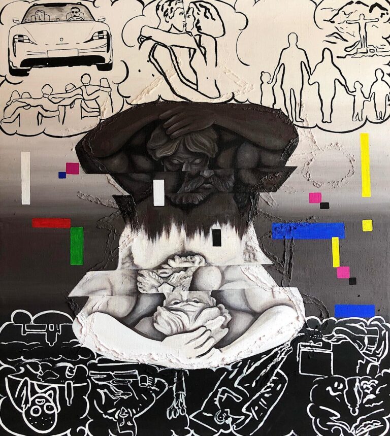
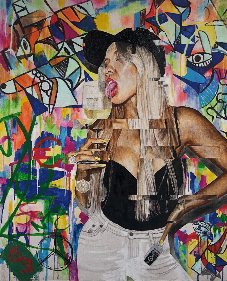
Two of my own canvases sit near this question, so I will put them here. In What is happiness? the thought clouds across the top are thin black outlines on a pale ground: a car, a kiss, a family holding hands. At the bottom the same kind of line turns white on a black ground, and the figures get stranger. In Alpha and Omega a painted woman stands in front of a wall of drips, scribbles and outlined shapes, which is the street side of my work. I am not borrowing Haring’s figures. What I share with him is the question of how much a single contour can hold.
I use the same test when thinking about street art and painting: a surface has a scale, a setting and a distance from the person looking. A strong image has to work through those conditions. A confident contour can invite someone in; the relationships inside it decide whether they stay. That is the part I keep returning to. I can recognise a line immediately and still spend time working out what it does.
More of my outline and street work is in the originals and the lithographs.
Anonymous contemporary pop artist with a studio in Poland. I paint original pop art in oil and acrylic and make hand-finished lithographs. About me · More from my journal